
Tuesday, May 15, 2012
Wednesday, May 2, 2012
digital design study

- this is a simple mock up, of my poster design.
- my project is going to be on the history of origami
- in the green boxes there will be origami hands pulling the corners of the poster, giving it the illusion of the hands folding the poster.
- info. will be in the red area, with texture.
Wednesday, April 25, 2012
history of origami poster...info

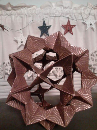
Origami (pronounced or-i-GA-me) is the Japanese art of paperfolding. "Ori" is the Japanese word for folding and "kami" is the Japanese word for paper. That is how origami got its name. However, origami did not start in Japan. It began in China in the first or second century and then spread to Japan sometime during the sixth century. |
Monday, April 2, 2012

Monday, March 19, 2012


Tuesday, March 6, 2012
Step 3. Historic design style to be implemented in my project design
 |
|
 |
|
 |
|
 |
|
 |
|
Step .2...3 favorite stamp designs
 |
| This commerative stamp of R. Buckminster Fuller was first released by the U.S. postal service on July 12th, 2004. 2004 was chosen for the relase date because it marked the 50th anniversay of Fullers patent for the geodesic dome.
|
 |
| This stamp was designed as part of a propaganda collateral for "Trampt" magazine. It was designed to be used in an upcoming spoof of a national fundraising intiative.
|
 |
| This stamp was released by the Royal Mail in England, with the theme being musicals. This piece was based on 2000AD aritst Leigh Gallagher post for SWD (graphics company.)in 2006.
|
Monday, March 5, 2012


Monday, February 27, 2012

Sunday, February 19, 2012
Project 1, form and Type Essay
Brandon M.
Intro. to Graphics
Groat
For this project,
I used six different design principles, to make one unified design. Also following the rule thirds, to make the overall design aesthetically pleasing. The key design terms used are...FLOW, ALIGNMENT,BALANCE, CONTRAST, REPETITION, AND EMPHASIS.
-I first started off with a few thumbnail sketches, but when I began to work on my project, i tried a variety of things until it bagan to shape itself.
-I placed the word Emphasis in the lower right of my design, with the words typed in an oval, I also applied a gradient and extra detail to draw the eye to that lower section. Which is also where the direction of the design begins. With the gradient and drop shadow applied to the word, not only does it visually emphasize the area but also provides a sense fo depth.
- Using the depth created by the previous word, i added into the design, I used the warp text tool, and also altered the shape and style of the word Flow. I tried to visually represent this principle, making alterations and aligning the words in such a way to give the illusion that the words are actually flowing into the the gradient used for Emphasis. I used this principle this way to help direct
the viewers eye around the design plane while still following the rule of the thirds.
- Directed in a upward motion by the word previous, the next principle used was Balance. I also use the warp text to on this word, I made this large and bold and also tweaked the shaping of it. I also made these slightly smaller each time I created one, along with tapering it off and proper positioning of each helped enhance the illusion of depth. I used this word to not only guide you eye to the next section, but also using it to make the design more ambiguous and less dominated by the forground. I used it in a more literal sense, and implemented it in such a way to provide balance to the overall piece.
- Following the depth created by the postioning of the word Balance the eye is brought to the next design principle used, that principle is Alignment. I made slight adjustment to the way the words were lined up, and by putting them slightly off, makes it look like I runs back into the distance. I used this word as the horizon line for my project, although the word wasnt used in a conventional sense, I used it to bring all the other designs into Alignment. With the horizon line the illusion of depth would be lost.
- Just above the horizon I used the next word, Contrast. I didnt want to over kill on this one, and making something large and chunky, pulling the eye away from Emphasis. I also used text warp here, to make the word arch, the arch and light lettering, I wanted to use it as a representation sun setting on a landscape. Thats why I used "light" contrast for my typograhical sun.
- The last design principle implemented in my design is Repetition, I arched the lettering the same as i did for contrast, but also made it taper off at the ends. I tried a variety of things and postioning with these as well, I found that by placing them in the way that I did, they look more like birds and less like words. Once I was happy with the shaping of them, I arranged to flow with the rest of the picture and to draw the eye back to the right side of the page, which completes the flow and adds to the overall harmony of this particular design.
- By implementing what I have learned and following the rule of thirds, i hope I made a design that comes across as visually appealing. I had a lot of fun working on this project.
Friday, February 17, 2012

Monday, February 13, 2012


Subscribe to:
Posts (Atom)